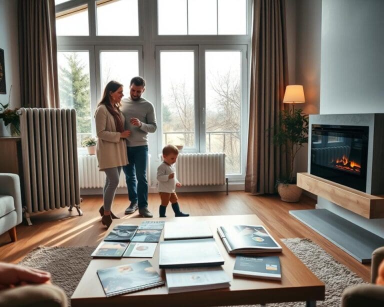
Selecting the right colors for your living room can be a daunting task, but it’s a crucial aspect of interior design that can greatly impact the ambiance and aesthetic of your home.
A well-designed living room color scheme can create a warm and inviting atmosphere, making it the perfect space to relax and socialize. With so many options available, it’s essential to consider various factors, including the room’s size, lighting, and furniture, to determine the best colors for your living room.
Key Takeaways
- Understanding the importance of color schemes in living room design
- Exploring different color options for various living room styles
- Learning how to choose the perfect colors for your living room
- Discovering the impact of color on the ambiance and aesthetic of your home
- Getting tips on how to balance color with furniture and decor
The Psychology of Color in Living Room Design
Colors play a pivotal role in setting the tone for your living room, impacting both mood and atmosphere. The right color scheme can transform a space, making it feel cozy, energetic, or serene. Understanding the psychology behind color choices is essential for creating a living room that not only looks great but also feels welcoming and comfortable.
How Colors Affect Your Mood and Emotions
Different colors can evoke different emotional responses. For instance, warm colors like red, orange, and yellow are known to stimulate feelings of energy and warmth, while cool colors such as blue, green, and purple tend to promote relaxation and calmness.
According to color psychologists, the impact of color on mood is rooted in both biological and cultural factors. For example, a study published in the Journal of Experimental Psychology: Human Perception and Performance found that color can influence mood and emotional states. As noted by color expert,
“Colors can directly influence our emotions, with warm colors often associated with increased heart rate and cool colors with a calming effect.”
- Red: Stimulates energy and can increase heart rate.
- Blue: Promotes feelings of calmness and serenity.
- Green: Associated with balance and growth.
- Yellow: Can boost mood and energy levels.
Creating Atmosphere Through Color Choices
The atmosphere of a living room is significantly influenced by its color palette. By choosing colors that align with the desired ambiance, homeowners can create a space that feels either cozy and intimate or open and airy.
| Atmosphere | Color Choices |
|---|---|
| Cozy and Intimate | Warm neutrals, deep reds, and rich browns |
| Open and Airy | Soft whites, light blues, and pale greens |
| Energetic and Vibrant | Bright yellows, oranges, and bold reds |
By carefully selecting colors based on their psychological effects, homeowners can craft a living room that not only reflects their personal style but also enhances their well-being.
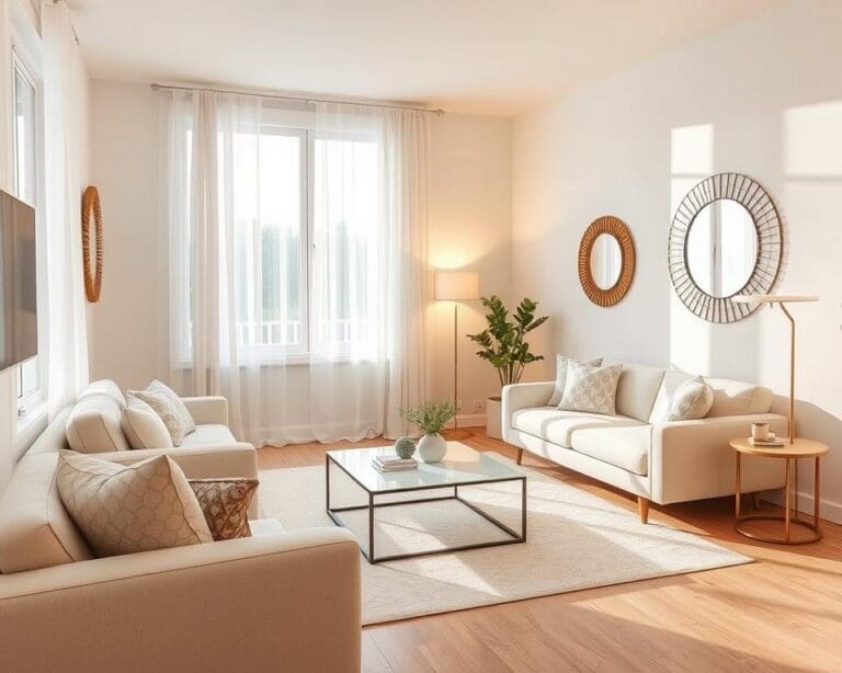
Timeless Neutral Color Palettes
Timeless elegance in interior design is often achieved through the use of neutral color palettes, which provide a versatile backdrop for any decor. Neutral tones have a way of making a room feel both cozy and expansive, making them a popular choice for living room designs.
Elegant Whites and Creams
Whites and creams are at the heart of many timeless designs. These colors can make a room feel clean, airy, and sophisticated. To add depth, consider layering different shades of white and cream through furniture, textiles, and wall colors.
For example, a cream-colored sofa paired with white accent chairs and soft gray rugs can create a harmonious and inviting atmosphere. Adding warm wood tones can further enhance the coziness of the space.
Sophisticated Grays and Taupes
Grays and taupes bring a level of sophistication to any living room. These colors are versatile and can be paired with a wide range of decor styles, from modern to traditional. Grays can range from very light to deep charcoal, offering a variety of options for creating contrast and interest.
Taupes, with their warm undertones, can add a cozy feel to a room. When combined with grays, they create a balanced palette that is both calming and stylish. Consider using gray walls with taupe furniture and accents for a sophisticated look.
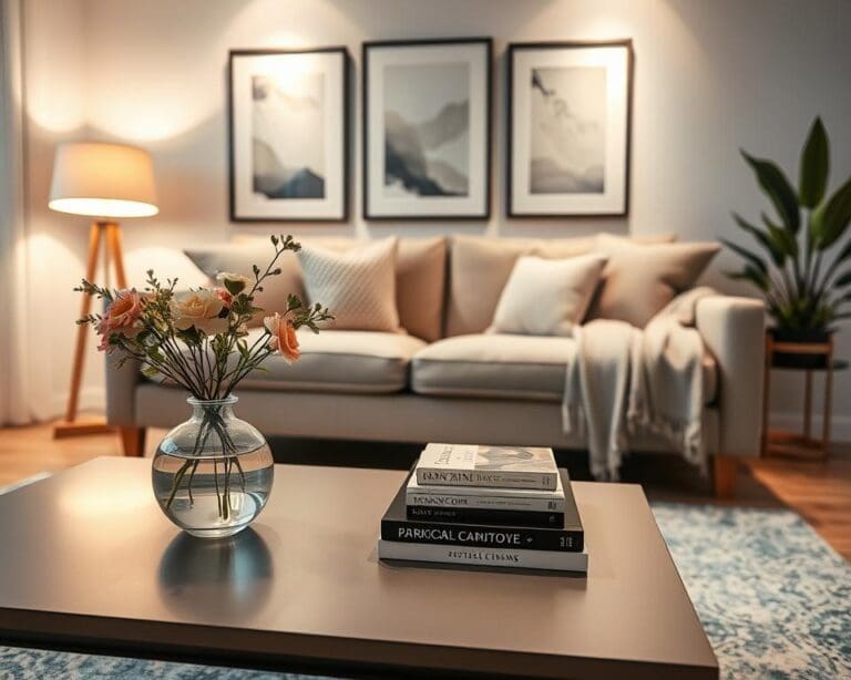
Warm Beiges and Earth Tones
Warm beiges and earth tones are perfect for creating a welcoming and natural ambiance in the living room. These colors are inspired by nature and can bring a sense of calm and serenity to the space. Beige walls, earth-toned furniture, and natural textiles can work together to create a harmonious and elegant interior.
To add visual interest, incorporate natural elements such as wood, stone, or plants. These elements not only enhance the aesthetic appeal but also contribute to the cozy and inviting atmosphere of the room.
Incorporating neutral color palettes into your living room design is a sure way to achieve a timeless look. By choosing the right shades and combining them effectively, you can create a space that is both beautiful and enduring.
Bold and Vibrant Color Schemes
For those looking to make a statement with their interior design, incorporating bold and vibrant color schemes into your living room can be a game-changer. Bold colors have the power to transform a mundane space into a vibrant and energetic area that reflects your personality and style.
When considering bold and vibrant colors, it’s essential to think about how they will impact the overall ambiance of your living room. Blues and teals can create a calming yet statement-making atmosphere, while reds and oranges can energize the space. Meanwhile, purples and violets can add a touch of luxury and sophistication.
Statement Blues and Teals
Blues and teals are versatile colors that can range from soft and serene to bold and dramatic. A statement blue or teal can be used as an accent wall, or incorporated through furniture and decor to add depth and visual interest to your living room.
“The right shade of blue can make a room feel calm and inviting, while a bold teal can add a fun and playful touch,” says interior design expert, Emily Henderson. When using these colors, consider pairing them with neutral tones to balance out the boldness.
- Pair bold blues with crisp whites for a nautical look.
- Combine teals with natural woods for a cozy, organic feel.
- Use blue-green hues to create a soothing, spa-like atmosphere.
Energetic Reds and Oranges
Reds and oranges are energetic colors that can stimulate conversation and create a lively atmosphere in your living room. These warm hues can be incorporated through accent pieces, rugs, or even a statement wall.
When working with reds and oranges, it’s crucial to balance them with cooler tones to avoid overwhelming the space. Terracotta and coral tones can add warmth without being too overpowering.
“A bold red can be the perfect addition to a room, adding energy and passion. However, it’s all about balance,” notes designer Jonathan Adler. “Pairing red with neutral tones can create a sophisticated and inviting space.”
Luxurious Purples and Violets
Purples and violets are luxurious colors that can add a touch of elegance and sophistication to your living room. From soft lavender to deep plum, these colors can be used to create a rich and regal atmosphere.
To incorporate purples and violets effectively, consider using them in accent pieces or as a statement wall. Pairing these colors with metallic tones like gold or silver can enhance their luxurious feel.
- Use lavender or lilac for a soft, romantic look.
- Incorporate deep plum or eggplant for a dramatic, luxurious feel.
- Pair purple with green for a bold, eclectic statement.
By thoughtfully incorporating bold and vibrant color schemes, you can create a living room that is not only visually stunning but also reflects your personality and style.
Wat zijn de mooiste kleuren voor je woonkamer? Expert Recommendations
A well-designed living room color scheme can elevate the entire ambiance of your home. When it comes to selecting the perfect colors, expert recommendations can be invaluable.
Designer-Approved Living Room Colors
Designers often recommend starting with a neutral base and adding pops of color through furniture and decor. Soft grays, creamy whites, and warm beiges are popular choices for creating a timeless look.
For those looking to make a statement, deep blues and rich greens can add depth and sophistication to a room.
Timeless Color Combinations That Never Fail
Some color combinations stand the test of time. Pairing warm beige with soft cream creates a cozy and inviting atmosphere. Another classic combination is gray and yellow, which adds a touch of brightness and elegance.
2023-2024 Color Trends to Consider
The latest color trends for 2023-2024 are all about embracing nature and sustainability. Earth tones such as sienna and umber are gaining popularity, as are soothing blues and calming greens.
- Terracotta and earthy reds are making a comeback, adding warmth to living rooms.
- Soft pastels are being used to create soft, calming environments.
- Deep charcoal and dark grays are used to add contrast and sophistication.
Choosing Colors Based on Living Room Size
The size of your living room plays a significant role in determining the most suitable color palette. Whether you’re working with a cozy, intimate space or a spacious, expansive area, the right colors can enhance the room’s dimensions and overall ambiance.
Color Strategies for Small Living Rooms
Small living rooms require careful color planning to avoid making the space feel cramped or claustrophobic. Two effective strategies for small living rooms are using space-enhancing light colors and strategic accent colors.
Space-Enhancing Light Colors
Light colors on walls and ceilings can create the illusion of more space. Shades such as soft whites, creamy beiges, and pale grays can make a room feel more airy and open. As Benjamin Moore’s color expert suggests, “Light colors can make a small room feel larger by reflecting light and minimizing visual boundaries.”
- Soft whites and creams
- Pale grays and blues
- Pastel shades
Strategic Accent Colors
While light colors can make a room feel larger, strategic accent colors can add depth and visual interest. Use a bold or bright color on a single wall or through accessories like throw pillows, rugs, and artwork to create a focal point. As
“Accent colors can add personality to a room without overwhelming the space.”
notes an interior design expert.
Expansive Color Schemes for Larger Spaces
Larger living rooms offer more flexibility when it comes to color choices. You can opt for a variety of color schemes, from monochromatic to bold and vibrant. Consider using darker, richer colors to create a cozy atmosphere or brighter colors to energize the space.
- Deep, rich colors like navy blues and emerald greens
- Warm, earthy tones like terracotta and sienna
- Vibrant colors like coral and turquoise
By choosing the right colors based on your living room’s size, you can create a space that feels welcoming and visually appealing.
How Natural Light Affects Your Color Choices
Understanding the impact of natural light on color choices can transform your living room’s ambiance. Natural light significantly influences how colors appear, making it a crucial factor in your design decisions.
For instance, a room with plenty of natural light can handle deeper, richer colors, while a room with limited natural light may require lighter shades to avoid feeling too dark or cramped. As experts suggest, maximizing natural light can make a space feel larger and more inviting.
North-Facing vs. South-Facing Rooms
The orientation of your living room plays a significant role in determining its natural light characteristics. North-facing rooms receive soft, indirect light, which tends to be cooler and more subdued. In contrast, south-facing rooms are bathed in direct sunlight, resulting in warmer and brighter conditions.
| Room Orientation | Natural Light Characteristics | Recommended Color Choices |
|---|---|---|
| North-Facing | Soft, indirect, cooler light | Cooler, calmer colors like blues and greens |
| South-Facing | Direct, warm, bright light | Warmer colors like oranges and yellows, or bold colors |
As interior design expert, Kelly Wearstler, once said, “The right color can make a room feel more vibrant, more alive, and more you.” Choosing the right color involves considering the room’s orientation and how natural light affects it.
“The way you light a room can completely change its atmosphere. Natural light is the most beautiful light, and understanding how to work with it is key to great design.”
Adapting Colors for Different Times of Day
Colors can change significantly at different times of day due to the shifting natural light. For example, a color that looks vibrant in the morning may become overpowering in the afternoon when the sun is stronger.
- Observe how the natural light in your living room changes throughout the day.
- Choose colors that work well with the room’s light at various times.
- Consider using colors that complement the natural light, enhancing the room’s ambiance.
By understanding and adapting to the natural light in your living room, you can create a space that feels welcoming and harmonious at any time of day.
Complementary Color Combinations That Work
Complementary color combinations are key to designing a living room that feels balanced and visually appealing. When done correctly, these combinations can create a harmonious and inviting atmosphere.
The 60-30-10 Color Rule Explained
A widely accepted principle in interior design is the 60-30-10 color rule. This rule suggests that 60% of the room should be a dominant color, 30% a secondary color, and 10% an accent color. This balance helps in creating a cohesive look.
For example, if you choose a neutral beige as your dominant color (60%), you can use a secondary color like blue for furniture and decor (30%), and then add pops of yellow through accessories (10%).
| Color Percentage | Color Choice | Example Elements |
|---|---|---|
| 60% | Dominant Color | Walls, Main Furniture |
| 30% | Secondary Color | Furniture, Curtains |
| 10% | Accent Color | Throw Pillows, Vases |
Creating Contrast Without Clash
Contrast is essential in interior design as it adds visual interest. However, it’s crucial to create contrast without allowing colors to clash. One effective way to achieve this is by using a mix of warm and cool tones.
For instance, pairing a warm-toned wooden coffee table with cool-toned blue sofas can create a striking contrast. Adding neutral elements can help mediate between different tones.
Harmonious Color Transitions Between Rooms
Maintaining harmonious color transitions between rooms is vital for a cohesive home design. One approach is to use a consistent color palette throughout the house, varying the shades and tones to create visual interest.
For example, if your living room is painted a light blue, you can continue this color scheme into the adjacent dining area by using a slightly deeper blue shade. This creates a sense of continuity.
By applying these principles, you can create a living room that not only looks beautiful but also feels harmonious and inviting.
Colors for Different Design Styles
Different design styles call for distinct color palettes that can enhance the beauty and functionality of your living room. The right color scheme can make your space feel more cohesive, reflecting your personal taste and the overall aesthetic you’re aiming for.
Modern and Contemporary Color Palettes
Modern and contemporary design styles often feature clean lines, minimal ornamentation, and an emphasis on functionality. For these styles, consider a palette that includes neutral tones such as whites, grays, and taupes. These colors provide a calm backdrop that allows statement pieces to shine. Accent walls in bold colors like deep blues or vibrant yellows can add a touch of personality to the room.
Traditional and Classic Color Schemes
Traditional and classic design styles are characterized by their timeless elegance and comfort. Rich colors like burgundy, navy blue, and emerald green are commonly used to create a warm and inviting atmosphere. Earthy tones and warm neutrals can also complement traditional decor, adding depth and coziness to the living room.
Scandinavian-Inspired Color Choices
Scandinavian design is known for its simplicity, functionality, and emphasis on light. Color palettes inspired by this style often feature a predominance of whites, creams, and light woods. Soft pastels and muted tones can also be incorporated to add a touch of warmth and personality to the space. The key is to maintain a light and airy feel, making the room feel spacious and welcoming.
Bohemian and Eclectic Color Combinations
Bohemian and eclectic design styles celebrate individuality and creativity, often resulting in vibrant and layered color schemes. These styles encourage mixing and matching different patterns, textures, and colors. Consider combining rich jewel tones with earthy neutrals, or pairing bold brights with soft pastels. The goal is to create a space that feels personal and visually interesting.
By understanding the color palettes associated with different design styles, you can make informed decisions that enhance the aesthetic and feel of your living room. Whether you’re drawn to modern minimalism or bohemian eclecticism, the right color scheme can bring your design vision to life.
Implementing Color Through Decor Elements
Once you’ve selected your perfect color palette, it’s time to think about how to implement it through different decor elements in your living room. This involves making decisions on wall colors, furniture, accent pieces, and textiles, all of which play a crucial role in bringing your chosen color scheme to life.
Wall Colors and Treatments
The color of your walls sets the tone for the entire room. When choosing a wall color, consider the natural light, furniture, and decor that will be in the room. Light colors can make a room appear larger, while dark colors can create a cozy atmosphere.
Different wall treatments can also enhance your color scheme. For example, a glossy finish can add depth and make colors appear more vibrant, whereas a matte finish can provide a subtle, understated look.
Furniture and Upholstery Selections
Furniture is a significant element in your living room, and its color can greatly impact the overall aesthetic. When selecting furniture, consider the color palette you’ve chosen and how different pieces will work together.
- Choose upholstery that complements your wall colors.
- Consider the color of wooden or metal furniture frames.
- Balance bold colors with neutral tones to avoid overwhelming the space.
Accent Pieces and Accessories
Accent pieces and accessories are an excellent way to add pops of color and personality to your living room. These can include throw pillows, vases, rugs, and decorative items.
When selecting accent pieces, think about the 60-30-10 rule: 60% of the room should be a dominant color, 30% a secondary color, and 10% an accent color. This rule helps create a balanced and harmonious color scheme.
| Element | Color Role | Example |
|---|---|---|
| Walls | Dominant Color (60%) | Soft Gray |
| Furniture | Secondary Color (30%) | Beige or Cream |
| Accent Pieces | Accent Color (10%) | Bright Yellow or Coral |
Textiles and Soft Furnishings
Textiles, including throw blankets, curtains, and rugs, play a crucial role in adding texture and color to your living room. They can also help tie together different elements of your color scheme.
When choosing textiles, consider their texture, pattern, and color. Mixing patterns can add visual interest, but be sure to balance them with solid colors to avoid a cluttered look.
By thoughtfully implementing your color scheme through these decor elements, you can create a harmonious and inviting living room that reflects your personal style.
Common Color Mistakes to Avoid
Color can dramatically change the feel of your living room, but certain pitfalls can lead to an uninviting atmosphere. When designing your living room, it’s crucial to be aware of common color mistakes that can impact the overall ambiance and aesthetic of the space.
Overlooking Undertones in Paint Colors
One of the most significant mistakes is overlooking the undertones in paint colors. Undertones can greatly affect how a color appears in your living room, depending on the lighting and surrounding decor. For instance, a paint color with a red undertone might clash with green furniture, while a blue undertone could complement it. Always test paint samples on your walls before making a final decision.
Tip: Observe the paint color at different times of day and under various lighting conditions to ensure the undertones work well with your space.
Creating Overwhelming Color Schemes
Another common mistake is creating an overwhelming color scheme. Using too many bold or bright colors can make your living room feel chaotic and uncomfortable. It’s essential to strike a balance between different colors and textures to create a harmonious atmosphere.
- Limit bold colors to accent pieces or a single wall.
- Use a neutral base color for larger furniture items.
- Balance warm and cool tones to create visual interest.
Ignoring the Room’s Purpose and Ambiance
Ignoring the intended purpose and desired ambiance of your living room can lead to color choices that don’t support the room’s function. For example, a room meant for relaxation should have calming colors, while a room intended for entertainment can have more vibrant tones.
Consider the activities that will take place in the room and choose colors that enhance these activities. For a cozy, relaxing atmosphere, consider earthy tones or soft pastels. For a more energetic vibe, brighter colors like yellows or oranges can be effective.
By being mindful of these common color mistakes, you can create a living room that is both beautiful and functional.
Conclusion: Creating Your Perfect Living Room Palette
Creating the perfect living room palette is a personal and creative process that involves considering various factors, including the room’s size, natural light, and your personal style. By understanding the psychology of color and exploring different color schemes, you can design a space that reflects your personality and meets your needs.
Whether you prefer timeless neutral tones or bold and vibrant colors, the key to a successful living room design is balance and harmony. Experiment with different colors and design elements to find the perfect color scheme for your living room. Consider the 60-30-10 color rule, and don’t be afraid to try out new combinations.
With the right living room palette, you can create a space that is both beautiful and functional. By applying the principles outlined in this article, you’ll be well on your way to creating an interior design conclusion that you’ll love for years to come.